I have been paying for DMD2 for a while. The feature list is right and the app is hard to use with a helmet on, and its address search is close to unusable. Kurviger gets the important idea right, curvy routing, and needs a connection to do it. Neither one records video the way TrackEncoder does.
So: Touge. Android, one APK, no subscription, nothing phones home. The phone can be in airplane mode for the whole drive.
The overlay goes around the video, not on it
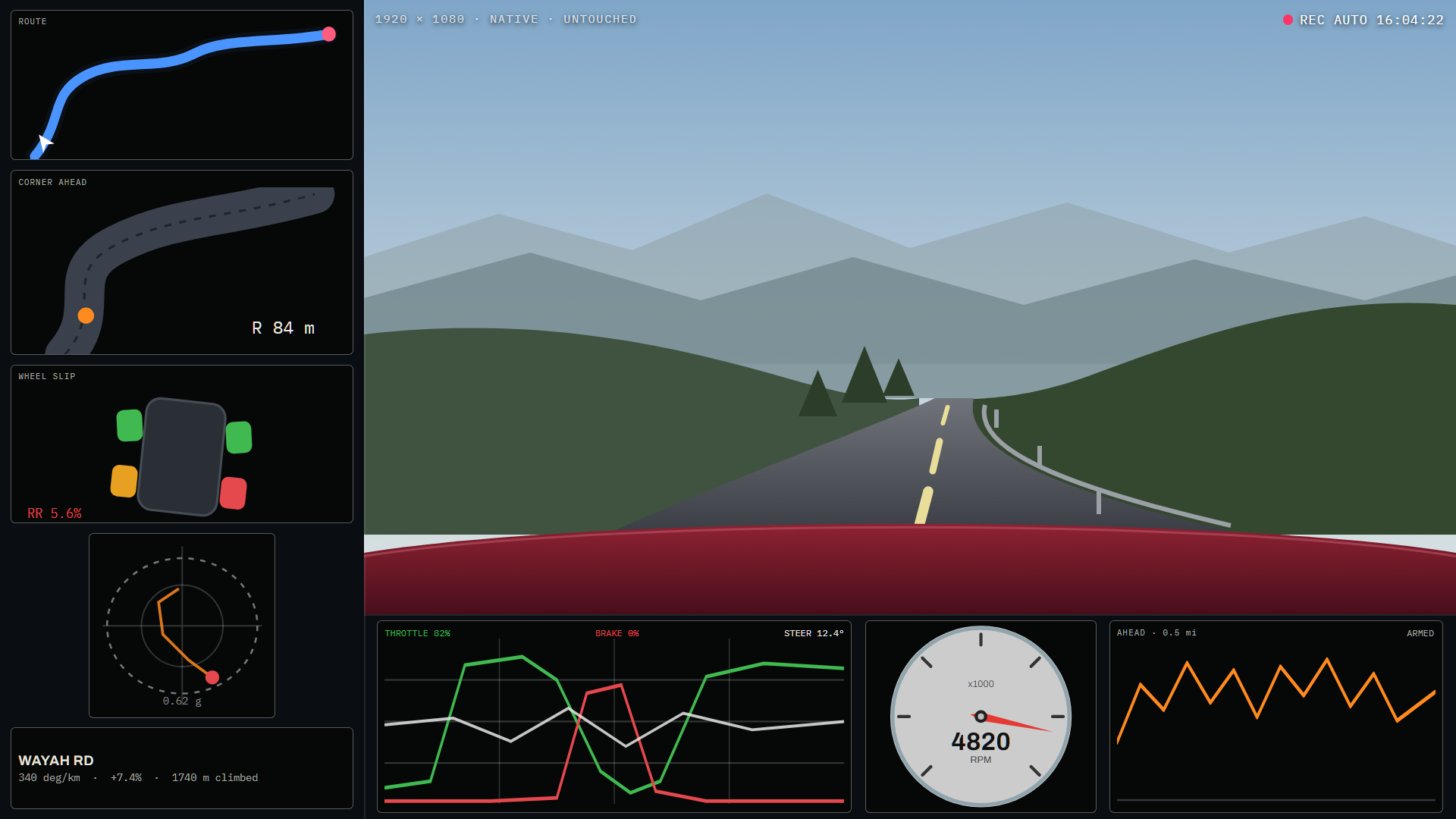
This is the part I am happiest with. TrackEncoder draws its cards on the camera picture, in the dead frame the windscreen mount leaves. That works, and it costs two things. Every card sits somewhere the camera could have shown road, and the whole layout has to be re-measured if the camera ever moves.
Here the output canvas is bigger than the camera picture and the cards live in the margin. A 1920x1080 webcam plus a third again of margin lands on 2560x1440, and the video is untouched, pixel for pixel. No scaling, no resampling, nothing drawn over it.
The reason I could do this at all is a measurement I already had. TrackEncoder accidentally recorded 2560x1440 for an hour straight last week, 106,299 frames over nine segments at 29.2 fps sustained, nothing stalled. So the pixel throughput was a known quantity rather than a hope.
Bitrate barely moves either, and that is worth saying because it sounds like it should. The margin is static and nearly flat, so inter-prediction encodes it to almost nothing. Growing the canvas costs encoder throughput, not file size, and throughput is the thing that was already measured.
Camera placement becomes a free choice. Bonnet, windscreen, behind the driver, all the same to the layout.
Every card has a switch, and the track ones are already off
The cards are laid out by weight rather than fixed rectangles. Switch the slip car off and the maps take its height, which is what makes a toggle worth having. Turn two off and the rest get bigger.
Anything that needs a surveyed circuit is off out of the box and stays off. Apex verdicts, braking zones, sector consistency, lap delta. There is no reference lap on Wayah Road and no lap to be down on, so those cards have nothing to compute from rather than nothing to show. They are all still there, grouped together, for the days I take the car somewhere with a start-finish line.
Same for the speed readout. Off by default, one switch, and it is the only one for it. A number in the corner of a mountain road video is evidence in a way the same drive without it is not.
Routes are picked on curvature, and the app shows its working
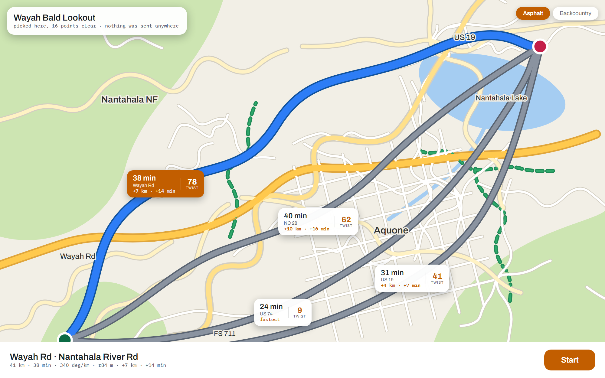
Every other nav app offers alternatives as “12 min faster” or “avoids tolls”, because time and tolls are what they can measure. This one measures the geometry the router already handed back: total heading change per kilometre, what fraction of the distance is inside a real corner rather than a bend, the median corner radius, junctions per kilometre. That becomes the TWIST number on each bubble.
The important design decision was not to ask a model to do this. Hand an LLM three routes and it has road names, road classes and a distance, and it will confabulate. “State Route 28 sounds scenic” is not a measurement. So the scoring is local and deterministic, and the model only ever breaks a genuine tie between already-scored candidates, with the numbers attached and a two and a half second timeout.
Most of the time it is not close. On the screenshot above the pick is sixteen points clear, and nothing was sent anywhere.
It took me a couple of goes to get this screen right. The first version was a list with a little curvature trace beside each route, and the trace answered the wrong question. The score already says which one is twistier. What a list cannot tell you is how far out of my way this takes me, and that is a geographic question: two routes six kilometres apart look identical in a table, and on a map one of them visibly loops north over a ridge.
So every candidate is drawn at once and the camera fits all of them, north up and flat. An overview that rotates with your heading is harder to compare shapes on, and comparing shapes is the only thing the screen is for.
Each bubble also carries the detour in plain numbers, measured against the fastest candidate rather than the shortest. The fast one is what a driver in a hurry would take; everything else is the price of the better road, and that price should be a number and not a feeling.
The labels go somewhere specific, too. Alternatives share most of their length, so a bubble at each route’s midpoint puts three of them on the same kilometre of shared road, each pointing at a line you cannot pick out. Each route is labelled at the point where it is furthest from every other candidate, which is exactly where they visibly diverge.
The fastest route is always drawn. Sometimes the point is to get there, and an app you have to argue with about that is one you stop trusting on the days it is right.
The dash
Map on the left, media pane on the right, the way the Bronco lays out Android Auto. I started by copying Android Auto’s split, then trimmed it, then went looking for what the actual standard is and found there isn’t one. Google publishes no ratio for Coolwalk. It tiles cards and the proportion falls out of the head unit’s aspect, its size, and which side you put the driver on.
So the pane is not a share of the screen at all. It is 260 dp, and the map takes everything else. What the pane needs is room for three controls and two lines of text, and that is a fixed number of dp; everything past it is album art, which is the only thing on there that is decoration rather than information. The 260 is derived: three controls at 64 dp with 16 dp between them is 224, plus padding. Below that they stop clearing a gloved thumb.
On a 1280 dp panel it works out to a fifth. On a wider one it is less, and the map gets the difference instead of the artwork growing, which is the point.
The pane reads the Android media session rather than integrating with anything, so Pandora, Spotify and a podcast app all work and none of them had to agree to it. Three controls and no station list. Browsing is a job for a stopped car.
The zoom setting is a distance, not a zoom number. Half a mile of road ahead is half a mile on any panel and at any latitude; a zoom level is neither of those things. Two corrections had to go in to make that true: the car sits 72% down the frame so only that much of the screen is actually lookahead, and a tilted camera sees considerably further than a flat one. Without both the map shows roughly half what you asked for.
Theme follows the sun at the car’s own position rather than the tablet’s night schedule. A nav display still glowing white at dusk on a mountain road is a safety problem, not a preference.
The recorder arms before the corner, not during it
The first version armed above 0.35 g of lateral load, and it would have recorded most of every interstate. A freeway sweeper and a mountain hairpin pull the same lateral g at their respective speeds. That is exactly what makes both of them comfortable, and it means g alone cannot tell them apart.
What separates them is radius, and radius falls out of two channels that are already streaming:
r = v² / a_lat

70 mph at 0.35 g  ->  285 m    interstate curve
35 mph at 0.35 g  ->   71 m    road worth filming
Same load. An order of magnitude apart in what they are.
But even that is reactive, and by the time enough corner has happened to detect a corner, the corner has happened. So the recorder reads the road ahead instead. The map pack carries the geometry of the road under the car, and MapLibre hands back the whole line rather than just the pixel you queried, so turning onto something good is knowable at the junction. Ten seconds of pre-roll means the turn itself is in the clip too.
Elevation went in as a trigger in its own right, off sideloaded SRTM tiles. A fast ridge road with long sight lines and big swings is one of the best roads on any map and it is not especially twisty. Curvature alone scored it as nothing.
And none of it arms on a freeway or a four-lane. Road class comes off the map
pack, and lane count and the one-way flag catch a divided US highway tagged
primary, which is most of them. Two-lane primary is never suppressed,
because a US route over a ridge is the entire point.
Police on the map, and what that actually costs
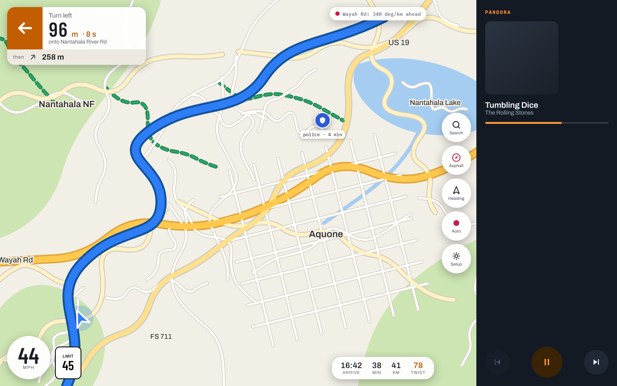
That blue pin is a police report from four minutes ago. Waze has no public API. The endpoint its own web map calls is undocumented, rate limited, and using it is against Waze’s terms of service, so it can change shape or start refusing requests any morning with no notice and no recourse.
Which means the only sane way to build it is to assume it will stop working. Every path through my code degrades to no icons, never to an error on the driving screen and never to a blocked navigation. The map works fine with the feed returning nothing, because that is the state it will eventually be in.
The interesting problem is not fetching it, it is staleness. A police report is worth something for about twenty minutes and nothing at all after an hour, and the feed will happily keep handing you one for far longer. A pin with no age on it is worse than no pin, because it invites you to trust a car that left before you set off. So every alert carries its age, the icon fades as it gets older, and the expiry is per type: police at 25 minutes because a speed trap is a car and cars leave, a closed road at six hours because it is still closed in the morning.
Two smaller things. The query box is thrown ahead along your heading rather than wrapped around the car, since half a centred box is road you have already driven and it is half the rate limit spent on nothing. And alerts are filtered against the route rather than the box, because a report two valleys over is inside any sensible bounding box and is not on your road.
Search that actually finds things
This is the thing that decides whether an app survives a trip, and it is the thing the offline apps in this space get worst. The failure is architectural: they search the rendered vector tiles, so they can only find what is currently drawn at the current zoom in the current viewport. Pan away and the result vanishes.
Touge searches a purpose-built index built from the same OSM extract the tiles were cut from. A diner 200 km ahead is as findable as one on screen. Every keystroke runs a prefix query, no debounce, because a prefix query over an indexed table returns in single-digit milliseconds and a debounce is only ever felt as lag.
Fuel, bathroom and food are one tap each, ordered by how far ahead they are rather than how close in a straight line. A place 400 m away across a river with no bridge is not near.
Two nice details in there. Food filters out chains using the brand:wikidata
tag, which is very close to the definition of a chain and needs no
hand-maintained list, and it checks opening hours against the clock with
overnight spans handled properly. Read naively, Fr-Sa 18:00-02:00 is an
empty interval and a bar reports closed all evening.
Fuel does the exact opposite with the same tags. A brand tag hides a restaurant and recommends a forecourt, because a brand is a promise about whether the lavatory has been cleaned today. Sheetz, Shell and BP first, in that order, then any other brand, then unbranded, which is ranked last and never hidden.
Bringing a route in
GPX import turns a track into shaping points the router will follow. Douglas-Peucker gets the structure, but the part that is not obvious is that simplification keeps corners, and on a road network a lot of corners are junctions. A junction is the worst possible place to pin a waypoint, because the coordinate can snap to any of four ways and the router quietly detours.
So every shaping point gets nudged along the track into the straighter run beside the bend, where there is only one road to snap to. There is also a two kilometre ceiling that forces points into long straights, or the router is free to take a completely different road between two pins forty kilometres apart.
What is built and what is not
Built and tested: the map stack on PMTiles read straight off the card, the curvature and relief scoring, the record trigger, the offline search index, GPX import, the opening-hours parser, the IMU zero, the split dash, the route choice screen. 186 unit tests, all green.
Not built yet: the router itself, and the encoder. Routing is going to be
BRouter. GraphHopper dropped Android and offline support, and Valhalla
on-device means an NDK build plus multiple gigabytes of routing tiles per
state on top of the map pack. BRouter was written for phones, its segment
files are about 150 MB per region, and its profile language weights surface
and tracktype directly, which is exactly the asphalt-versus-fire-road split
the two vehicle modes are made of.
The encoder is mostly a lift. TrackEncoder already draws every one of these cards and has debugged them on track, so the job is moving that code across rather than writing a second version that disagrees with the first.
Map packs
Nothing downloads inside the app. A pack is files you copy onto the device:
Android/data/com.geekopolis.touge/files/packs/
    nantahala.pmtiles     vector tiles
    nantahala.poi         SQLite POI and address index
    dem/N35W084.hgt       elevation, three arc-second SRTM
Planetiler cuts the tiles, a script in tools/ builds the POI index off the
same extract, and the SRTM tiles are downloaded as-is with no conversion step.
Nothing expires, and the pack survives an app update because it lives in
external files rather than inside the APK.