Three laps back to back at NCCAR on 12 September 2026, exactly as I drove
them: a lap stuck behind traffic (1:47.5), the lap after it (1:40.95), and my
best of the day (1:40.46). Every system in this post is working at once. On
the exit of T7 the rear steps out on the throttle: POWER OVERSTEER lights,
red rings ping over the rear tyres, the amber and red ribbons stack along the
top of the input trace, and the corner card scores each corner as it happens,
APEX EARLY, the delta ticking against the reference lap. The traffic lap is
the comparison the overlay exists to make: the same corners, three times,
scored the same way, with the COASTING chip and a [3.3 s] coaching line
saying exactly what following a slower car cost. Top-left, the ghost-car
panel paints the corner ahead on satellite imagery of the circuit: my best
lap on the road in brake/transition/throttle colours, the hollow ghost
running its clock, and my dot, lit by my own pedals, chasing it.
What this thing is
TrackEncoder is an Android app that takes a USB camera feed and a USB microphone, pulls my RaceCapture MK4’s CAN telemetry over Bluetooth, burns a coaching overlay into the video live, and writes the lot to an SD card in the car. No post-processing, no syncing data to footage afterwards — the analysis is already in the frame when I get home.
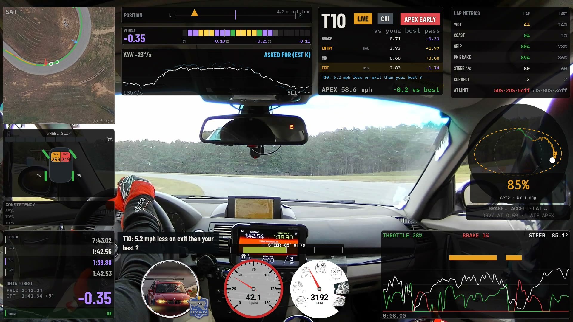 The whole thing as it ships today, on the in-car Moto G at NCCAR on 12 September 2026: lap 4, turning in to T10 at 42 mph, 0.35 s up on the reference lap, the yaw panel and the corner card both live. Everything sits on the A-pillar, the headliner and the dashboard, the parts of the frame the car body blocks anyway. Only about 20% of a bolted-in camera’s frame ever carries road, and the overlay is laid out around that. The ghost-car panel is top-left, on satellite imagery of the circuit.
This is the whole system in one post: every card on the screen, clockwise, plain English first and the maths under it, the rules the metrics follow, the ghost-car racing line, running it from my pocket, the voice in my helmet, the session handoff to a language model, and a street mode that puts most of it away.
The overlay, card by card
NCCAR, 12 September 2026, lap 4 of the afternoon session, turning in to T10,
the right-hander at the back of the new chicane. 42 mph, 85° of lock on the
hand wheel, 0.35 s up on the reference lap. Every card below is cut from this
one frame, so the numbers on them agree with each other.
Thirteen cards. Starting top-left and going round the screen clockwise, each one gets the plain-English reading first, then the technical details: what is measured, what is computed from it, and where every constant came from. Where a card already has a long section further down the post, the details here are the short version and link to it.
1. SAT: my best lap painted on the real road
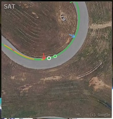 T10 on satellite imagery of NCCAR, about 430 ft of ground around the car.
The wide line is my best lap on the actual tarmac, coloured by its pedals.
The thin line is this lap. The dot is me, the hollow ring is the ghost, and
the arrows are the three apexes.
T10 on satellite imagery of NCCAR, about 430 ft of ground around the car.
The wide line is my best lap on the actual tarmac, coloured by its pedals.
The thin line is this lap. The dot is me, the hollow ring is the ghost, and
the arrows are the three apexes.
In plain English. This is the racing-game view. My fastest lap of the session is painted onto a photograph of the circuit: red where it was braking, amber from brake release to the apex, green on the throttle. My current lap draws over it in the same colours from my own pedals, so where my red starts against where the paint turns red is the brake-point comparison, on the road, before the corner arrives. The ring is my best lap replayed on this lap’s clock. Ahead of the dot, I am losing. Behind it, I am winning.
The three arrows are apexes. Green is where the car should apex given its own power against its own grip. Blue is where my best lap apexed. Red is where this lap apexed. When they stack, the corner is solved. When they spread along the road, the gap is the lesson.
The technical details. The photo is stitched satellite tiles, georeferenced into the same local-metre frame as the surveyed centreline, so the painted line and the photographed asphalt cannot drift apart by construction. NCCAR’s image is 3010 by 4841 pixels at 0.240 m per pixel, built offline and cached on the phone for a venue with no signal. The line is my best lap’s position recorded metre by metre, and the ghost is that lap replayed through the delta grid’s per-metre clocks (card 3). Nothing on this card is scaled: a metre across the road on screen is a metre across the road, and the live line and the painted line are built from the same per-metre laterals with the same smoothing over about 30 ft of road, so a line driven the same twice draws the same twice. Only the car dot is rate-limited, and only enough to swallow a GPS teleport.
The green apex is placed by arc, not distance:
capability = p99 longitudinal g ÷ p99 lateral g      from the grip envelope, this session
remaining  = 90° × (1 − capability)                  turning still to do at the apex
apex       = first metre where cumulative heading change ≥ total − remaining
The idea is Paradigm Shift Racing’s, the linear mapping across the 90° is mine, and both are argued out in full in the ghost-car section.
2. POSITION: where the car sits across the road
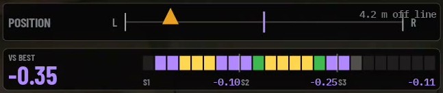 Top row: the road as a line from its left edge to its right, the surveyed
line as the purple tick in the middle, my car as the amber marker. 4.2 m
(14 ft) left of the line, turning in to a right-hander. Bottom row is card 3.
Top row: the road as a line from its left edge to its right, the surveyed
line as the purple tick in the middle, my car as the amber marker. 4.2 m
(14 ft) left of the line, turning in to a right-hander. Bottom row is card 3.
In plain English. Am I using the whole road? The marker is where the car is across the tarmac right now. Left of the purple tick is left of the surveyed line. It goes red when I am within a car’s width of the edge, which on a fast lap is exactly where it should be on entry and exit, and on a timid one never is.
The technical details. The offset is the cross-track distance from the GPS fix to the surveyed centreline, signed positive to the left, in metres. The bar’s width is the track’s surveyed width, 12.35 m at NCCAR, so the marker is placed at:
frac   = 0.5 − offset / trackWidth        0 = left edge, 1 = right edge
red    when |offset| > 0.42 × trackWidth   a car's width from the edge
This is the one card on the screen that depends on GPS position alone. Wheel speeds cannot help with sideways, so its accuracy is the receiver’s lateral accuracy and nothing better, and the track file carries that figure so the coaching can decide whether track-out advice is honest at this venue. The card prints metres today; feet are coming.
3. VS BEST: the lap in 24 pieces
In plain English. The big number is how far up or down I am on my best lap at this point on the track, not at this moment in time. The ribbon is the lap cut into 24 equal lengths of road, each one coloured as I complete it: purple I beat my best there by a clear margin, green I gained a little, yellow I lost. Grey is road I have not reached yet, and the brighter grey cell is the one I am on. Under the ribbon, the three sector totals.
So in the crop above I am 0.35 s up. S1 was worth a tenth despite three yellow cells in the middle of it, S2 a quarter, and S3 has just started and is a tenth up already.
The technical details. The delta grid keeps a millisecond clock for every 1 m cell of the lap, for the current lap and the reference lap, on a lap-distance channel that repeats to about 2.4 m at the same fixed point on the map (typical error, replayed over three sessions). The delta at any point is the difference of two clocks at the same cell, so it is a subtraction, not a model:
delta(here)      = t_this(cell) − t_ref(cell)
segment k gain   = delta(end of k) − delta(start of k)        24 segments
sector s         = Σ segment gains over its 8 segments
Colours: purple below −40 ms, green any gain, yellow any loss. The whole
thing is checked against the one number that cannot argue: the delta as the
car crosses the line must equal this lap’s time minus the reference lap’s
time. Over real logged sessions they agree within 19 ms, under one telemetry
sample. The first lap of a session reads NO REFERENCE LAP YET rather than
comparing against nothing. More on the delta and its checks below.
4. YAW: what the steering asked for, and what the car did
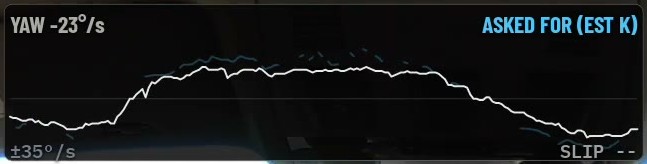 White is the gyro: the car rotating at 23 °/s into a right-hander. Blue is
the yaw rate the steering asked for through the bicycle model. The scale
follows the window’s peak, ±35 °/s here. The footer carries the slip angle
and, once the car constants are measured, the balance verdict. This frame is
from the afternoon: the constant was measured off this session’s own
sweepers that evening, so the header still says EST K.
White is the gyro: the car rotating at 23 °/s into a right-hander. Blue is
the yaw rate the steering asked for through the bicycle model. The scale
follows the window’s peak, ±35 °/s here. The footer carries the slip angle
and, once the car constants are measured, the balance verdict. This frame is
from the afternoon: the constant was measured off this session’s own
sweepers that evening, so the header still says EST K.
In plain English. Two lines that should sit on top of each other. The white one is how fast the car is actually turning. The blue one is how fast it should be turning for the amount of steering I have on, at this speed, in this car. When white falls below blue the front is not delivering what I asked for: understeer, PUSH. When white climbs above blue the rear is helping more than the steering asked: ROTATING. Inside 2 °/s of each other the car is NEUTRAL and the footer says so. The SLIP figure is how far the car is pointing away from where it is going, and it is coloured for use, not fear: grey means grip going spare, green means the tyres are at their peak, red means past it.
The technical details. The reference is the linear bicycle model from Milliken, the same relation inside every production stability-control ECU:
δ      = SteerAngle × steering_sign ÷ steering_ratio      road-wheel angle; 12.5:1 measured
r_ref  = v · δ / ( L · (1 + K · v²) )                     yaw rate the steering asked for
error  = r_ref − r_gyro                                   + PUSH, − ROTATING, |error| < 2 °/s NEUTRAL
L is 2.66 m, BMW’s published wheelbase for the E82. K is the understeer
gradient, 0.00268 s²/m², which is 4.0 °/g at the road wheel, measured this
month on NCCAR’s three sweepers and written up in
its own section. The verdict only
computes while the car is in a steady corner: above 15 mph, above 0.30 g
lateral, hands moving under 60 °/s, and it is smoothed with a 60 ms time
constant so one bump does not print ROTATING. The reference line draws
dimmed, and the verdict stays off the footer, until vehicle.json says the
constants were measured. A confident model with a guessed K reads permanent
understeer at speed.
The slip angle is the gyro and the lateral accelerometer disagreeing:
dβ/dt = a_y · g / v − r_gyro leaky-integrated, so gyro bias bleeds away
Bands: under 5° grey, 5 to 10° green, over 10° red. The band is wide because
the exact peak is a property of the tyre carcass and no tyre curve for this
compound exists yet. The readout blanks to SLIP -- when the gyro is stale
or the integral has run past 14°, which is the same sanity gate the slip car
uses for its body twist. One more constant lives under this card: the car
file records which way the IMU is mounted, because on this car the lateral
accelerometer and the yaw gyro read the same event with opposite signs
(correlation −0.988 over 38,086 samples above 30 mph). Measured, and applied
once, where the two are subtracted.
5. The corner card
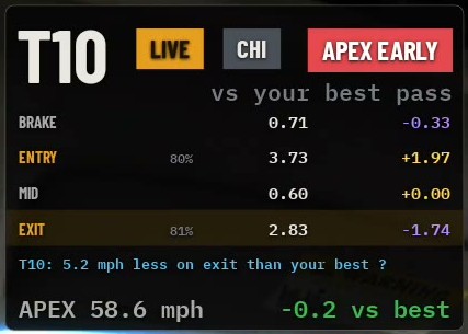 T10, live, a chicane corner, scored APEX EARLY. Four phases timed against my
best pass through this same corner, the grip used through entry and exit,
the coaching line, and the apex speed against the best.
T10, live, a chicane corner, scored APEX EARLY. Four phases timed against my
best pass through this same corner, the grip used through entry and exit,
the coaching line, and the apex speed against the best.
In plain English. Every corner gets a report card the moment I leave it. The number is the circuit’s own turn number, not a count the software made up. The chips say whether this is the live corner or the last one, what shape it is (CHI for a chicane, DBL for a double apex), and the verdict: APEX EARLY, APEX LATE, LATE THR, SPIN, LATE BRAKE, or nothing if it was clean. Then four rows, one per phase of the corner, each a time and how it compares with my best pass through this corner: green is quicker, purple is slower. The percentages beside ENTRY and EXIT are how much of the available grip I used through each. The line under them is the one thing worth changing, with the time it is worth. The last row is the apex speed and the gap to my best.
In the crop: brake zone 0.33 s quicker than my best pass, entry 1.97 s slower, exit 1.74 s quicker, apex 0.2 mph down. That is a corner that was turned in early, ran a long slow middle, and then got a good exit out of it. The verdict chip agrees.
The technical details. A corner is identified by the nearest track-map point at the lateral-g peak, so the same bend is recognised lap after lap without a lap-distance channel. The four phases:
BRAKE   brake onset → turn-in (lateral load rising)
ENTRY   turn-in → apex window
MID     a fixed 0.6 s window centred on the apex (±300 ms)
EXIT    apex window → corner end (lateral load gone)
MID is a datum rather than a phase, which is why it reads 0.60 and +0.00 on
every corner: ENTRY and EXIT are measured to and from it. The deltas are
cell-clock subtractions against the stored best pass, the same arithmetic as
card 3. The grip percentages are the mean of g / envelope (card 7’s
fraction) through that phase; trail-braking round the bottom of the
friction circle scores high on entry, an L-shaped brake-then-turn scores low
even when its time looks fine.
The apex placement is measured from the kinematic yaw rate, no gyro involved, and compared with where the car’s own capability says the apex should be:
dψ         = a_y · g / v · dt                integrated from turn-in
placement  = arc at apex ÷ total arc
target     = 1 − (90° × (1 − drive/lat)) ÷ total arc
APEX EARLY   throttle opened then closed, or speed reversed, or placement > 12% of arc before target
APEX LATE    placement > 12% of arc after target
LATE THR     throttle opened > 400 ms after the apex with no wheelspin
SPIN         late throttle with confirmed exit wheelspin: stated, not scolded
LATE BRAKE   a chicane where the car was not slowing as the steering crossed centre
Two tests were measured and rejected before shipping. “Full throttle at the apex” cannot be measured on this car: median peak throttle after the apex is 44% of travel because the exit is wheelspin-limited, so the card watches the throttle opening instead. And the 90° rule is only flagged on the entry arc (p90 90.0° over 299 corners); the exit arc on a sweeping section absorbs the next corner and reads 177° at p90, which is two corners rather than one bad one. Entry shape is also scored: curvature should rise linearly from turn-in to apex like an Euler spiral, so the correlation of curvature with time is computed, 1.0 is textbook, and under 0.6 the ENTRY label goes amber for a stepped turn-in. Median across my logs is 0.73.
6. GRIP: the friction circle
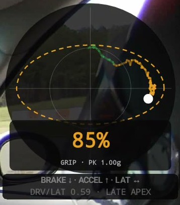 Top-right of the screen as it ships now. The dot is the car’s combined g right now, 85% of the envelope in that
direction. The dashed egg is the envelope: the most these tyres have shown
on this surface, per direction, at this speed. The trail is the last few
seconds, coloured by phase. Under it, the car’s place on the apex
spectrum.
Top-right of the screen as it ships now. The dot is the car’s combined g right now, 85% of the envelope in that
direction. The dashed egg is the envelope: the most these tyres have shown
on this surface, per direction, at this speed. The trail is the last few
seconds, coloured by phase. Under it, the car’s place on the apex
spectrum.
In plain English. The dot is what the tyres are doing now: down for braking, up for accelerating, sideways for cornering. The dashed ring is the most they have ever done on this tyre and this surface, remembered between sessions, so the first corner of the day is measured against the same ring as the last one. If the dot lives on the ring, I am using the car. If it sits inside, I am not. It is egg-shaped on purpose: this car brakes and corners far harder than it accelerates, and a perfect circle would make every power-limited exit look like cowardice. The line under it turns that shape into advice: DRV/LAT 0.59 means the car can accelerate at 59% of what it can corner at, and a car like that wants a late apex.
The technical details.
|g|      = √(a_x² + a_y²)
GRIP %   = |g| ÷ envelope radius in the dot's direction
envelope = max( stored floor, p99 this session )   for brake, accel and lateral, per speed band
bands    = <40, 40–70, >70 mph, crossfaded over ±5 mph of each edge
floor    = rises when the session p99 clears it with ≥ 10,000 samples in the band; never falls
DRV/LAT  = accel ÷ lateral      <0.35 EARLY-MID APEX, <0.70 LATE APEX, else VERY LATE APEX
The envelope is a property of the tyre, the surface and the car, so it is
filed the way the corner bests are, per tyre and surface bucket, and kept
between sessions. What is stored is a floor the ring never goes below. It
rises when a session’s 99th percentile clears it with five minutes of data
in the band behind the number, which is the spike guard: a two-second kerb
strike is 0.6% of those samples and cannot set the floor. It shrinks only
when the conditions change (a different file) or when I press GRIP on the
Telegram card. Banded by speed because the achievable g-g set changes with
speed, and blended across the band edges so crossing 40 mph mid-corner
moves the ring instead of jumping it. On this car at NCCAR the three bands
came out within 0.1 g of each other (lateral 0.96, 1.07, 1.04 g). PK
1.00g is the envelope radius in the dot’s current direction. The
apex-spectrum line is the same idea as the green arrow on card 1, in words:
the ratio of the two halves of the envelope.
7. LAP METRICS: how the lap was driven
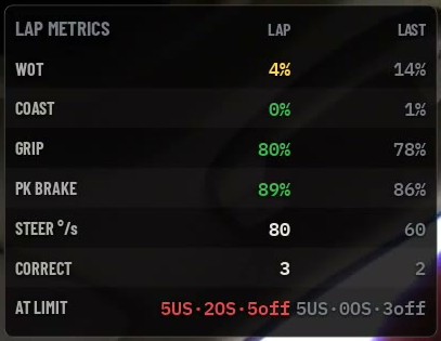 Live lap on the left, last completed on the right. Green beats the session
best, red is worse. AT LIMIT reads 5US·2OS·5off: five understeer events, two
oversteer, and five of the seven on the wrong side of the racing-line rule.
Live lap on the left, last completed on the right. Green beats the session
best, red is worse. AT LIMIT reads 5US·2OS·5off: five understeer events, two
oversteer, and five of the seven on the wrong side of the racing-line rule.
In plain English. Seven habits, scored per lap. The card lives in the
right column under the grip circle and only appears for six seconds after
a lap closes, when its LAST column has just been filled: it is a debrief,
not an instrument, and it earns its space when the lap it describes has
just ended. How much of the lap was
flat out. How much was coasting, which is the biggest single time-loser in a
novice’s data. How much of the available grip I used on average. Peak brake.
How smooth my hands were, and how many times I had to correct. And how often
I asked the car for more than it had, split into understeer and oversteer
because the fix is different: one is entry speed, the other is the right
foot. The off count is the subset that were on the wrong side of the
corner, understeer on the exit or oversteer on the entry, which are line
errors dressed up as grip problems.
The technical details. The full table with every definition is in Lap metrics. The rules: everything accumulates on a clock, never on a count of samples or frames, because the render loop runs at display refresh and telemetry arrives at whatever rate the car delivers. The off-side rule is Paradigm Shift Racing’s: the car should be at the understeer limit on entry and the oversteer limit on exit, so an event on the other side is counted separately.
8. The input trace
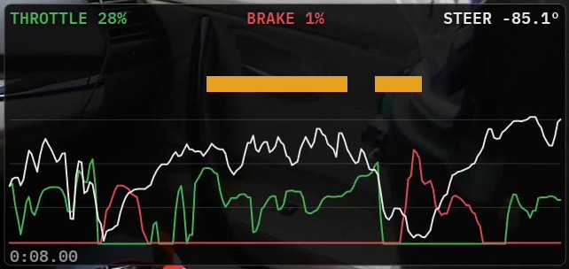 Eight seconds of my feet and hands. Throttle green, brake red, steering
white, the MoTeC and AiM colour convention. The amber bars across the top
are AT LIMIT events, understeer; red would be oversteer. A full-height
yellow wash marks a coast. The readouts above are the live values.
Eight seconds of my feet and hands. Throttle green, brake red, steering
white, the MoTeC and AiM colour convention. The amber bars across the top
are AT LIMIT events, understeer; red would be oversteer. A full-height
yellow wash marks a coast. The readouts above are the live values.
In plain English. This is the panel a data coach reads first. A smooth lap has a green line that opens once and stays open, a red line that is one clean spike per corner, and a white line that turns once and unwinds once. Stabs in the green are hesitation. A red line with two humps is a driver who braked, released, and braked again. The amber bar over this stretch is the car telling me I asked for more front grip than it had, for exactly that long. The percentages are of my pedal travel, learned this session, because my throttle reads 12 at rest, not 0.
The technical details. The channels are the car’s own: throttle position from the ECU, brake pressure from the line, steering angle from the column, all at whatever rate the RaceCapture delivers over WiFi, 48 Hz on the car. Throttle and brake are shown as a percentage of the travel learned this session, not of the sensor range. The limit ribbon, the coast wash and their rules are each their own section: coasting, AT LIMIT, and why slip decides when the car is working. The 0:08.00 in the corner is the window width; it is short so one corner fills the panel.
9. The dials and the steering bar
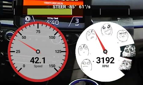 Speed and revs. Above them the steering bar, 85° of lock at
61 °/s: length is how far I have turned, colour is how fast.
Speed and revs. Above them the steering bar, 85° of lock at
61 °/s: length is how far I have turned, colour is how fast.
In plain English. Speed in mph and engine speed, because a video with no speedo is a video nobody can learn from. The steering bar above the speed dial is about the hands rather than the wheel: a green bar is a smooth input, a red one is me catching something. The number next to it is the rate, because a colour with no number behind it is not reviewable.
The technical details. Speed is the calibrated mph channel that every cross-channel comparison in the app uses, never a raw wheel count. The steering bar’s colour scale is measured from every log I have: ordinary driving lives under 150 °/s, catching a slide runs 175 to 400, so full scale is 400 °/s and the session maximum is capped at 800 because one glitched sample read 1307. Details in the steering bar.
10. The call: one line of coaching, with its price
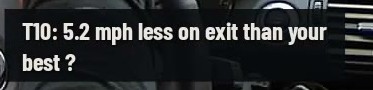 The newest coaching line, wrapped to two lines so it survives the video.
This one carries a
The newest coaching line, wrapped to two lines so it survives the video.
This one carries a ?: the exit-speed threshold was still a desk number
when the frame was recorded. It was measured off this session that evening
and the mark is gone.
In plain English. One sentence per corner, only when there is something
worth saying, and always in the circuit’s own turn number so I can repeat it
to an instructor. Braked earlier than my best, turned in early, slower at
the apex, slower on exit, each in feet or mph against the best pass I have
made through that corner. Where the delta grid can price it, the line ends
with the time it was worth: [0.2 s]. A ? on the end means the threshold
that fired the line has not been measured yet, so read it as a hint rather
than a finding.
The technical details. Each line compares this pass against the stored
best pass through the same corner, in the same tyre-and-surface conditions.
The thresholds live in a file with a measured flag on each, and the flag
is what draws the ?. Three of the four are measured as of this weekend,
each tuned so it fires on roughly one corner in five, because a flag that
fires every corner gets ignored:
apex speed   3.0 mph   measured, CMP 117 comparisons + NCCAR 45
exit speed   5.0 mph   measured, NCCAR 45 comparisons: 3.0 fired on 38% of passes, 5.0 on 22%
turn-in      50 ft     measured, NCCAR: the old 16 ft desk value fired on 49% of passes, 50 ft on 20%
brake early  33 ft     still a desk number, still carries the ?
The cost in brackets is the difference of cell clocks across the corner’s whole extent, braking zone through to where the next straight has begun, because a bad exit is paid for on the straight. Turn-in is measured from where lateral load actually rises, not where the map thinks the corner starts. Lines are ranked by that measured cost, so “the three things worth the most time” means top three by seconds. The coaching section has the voice, the ratchet and the turn numbering.
11. The timing stack
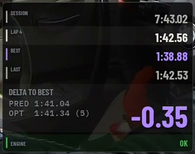 Session clock, the live lap, the reference lap, the last lap, and the delta
in large type. BEST is the lap the delta is measured against, and its chip
says where it came from: this session, today, or the last 48 hours. PRED is
where this lap lands if the delta holds. OPT is the lap already driven in
pieces, with the number of joins it took.
Session clock, the live lap, the reference lap, the last lap, and the delta
in large type. BEST is the lap the delta is measured against, and its chip
says where it came from: this session, today, or the last 48 hours. PRED is
where this lap lands if the delta holds. OPT is the lap already driven in
pieces, with the number of joins it took.
In plain English. The lap timer, plus two numbers a stopwatch cannot give you. BEST is the reference everything else on the screen compares against, and which lap that is, is a setting: the best of this session, the best of today, or the best of the last 48 hours, which is a track weekend. The stored laps are filed by track, car, tyre and surface, so yesterday’s dry lap is never the target in the rain, and a lap driven today that beats the stored one takes over on the spot. PRED is this lap’s time if I hold the gap I have right now. OPT is the best lap I could have driven today from pieces I actually drove: the fastest run through each stretch, joined only where the joins ask nothing of the car. The bracket is how many joins it took; a lap with five joins is a lap I could do, one with forty is a collage. The ENGINE row is a single word until it is not.
The technical details. PRED = reference lap + delta(here). The
reference is the fastest accepted lap the window admits, kept between
sessions as the grid’s own material, a millisecond clock and a lateral
offset for every metre of the lap, so a stored reference drives the delta,
the ghost and the painted line exactly as a live one does. Positive is
slower and carries a +; negative is faster. Slower is yellow rather than
red, the F1 timing convention, because red on this overlay is reserved for
faults. OPT is harder than it looks. Adding up the quickest time through every cell gives
a lap eleven seconds faster than anything I have driven, because consecutive
cells come from laps carrying different speeds and the car would have to
change speed instantly at every seam. So a join is only allowed where two
laps are at the same place and the same speed, and only in the middle of a
straight, where the car is settled. Measured on 19 CMP laps:
splice anywhere speeds match   96.0 s   −7.6 s on the best   387 joins
splice mid-straight only      102.9 s   −0.7 s on the best     2 joins
If the composite ever comes out slower than the best lap it prints nothing, because a lap has a hole in it and the result is built from fragments. The ENGINE row watches oil and water against their limits and names the worst offender with its value when one crosses.
12. CONSISTENCY: which part of the lap I am not repeating
In plain English. Consistency is the thing a quick driver runs out of last, so the useful question is not “how much do my lap times vary” but “which part of the lap am I failing to repeat”. Three percentages, all smaller is better. SEQ3: can I do it three times in a row, right now. TOP3: how close are my three best. TOP5: how deep does the pace go. Dashes until there are enough laps to compare, which is where the frame above was: early in the session.
The technical details. Whole-lap variance hides the answer: two corners half a second apart in opposite directions read as a perfect lap. So it is measured per sector from the cell clocks and then averaged, and each figure is a coefficient of variation so a 130 ft sector and a 2,300 ft one are comparable:
sector time  = t(cell at sector end) − t(cell at sector start)     per kept lap
CV(sector)   = σ_population(times) ÷ mean(times)
figure       = mean of CV over sectors with ≥ 2 valid laps
SEQ3 = best three consecutive laps     TOP3 = three fastest     TOP5 = five fastest
The sectors are the Garmin Catalyst’s own, from the track file. The formula is not Garmin’s, which could not be reproduced from lap times; expect these to track the device closely and not to match its third decimal. The coaching log records the same three figures at every lap with the count of usable sectors, so a session can be checked afterwards.
13. WHEEL SLIP: which tyre let go, and why
In plain English. The car from above, with a percentage at each wheel. A rear turning faster than the car is wheelspin and colours up green to amber to red. A wheel turning slower is a lock-up and pings blue, because it is a different fault rather than a worse one. Rings flash over the tyre that misbehaved and fade, so I see when it happened. The chip names it: POWER OVERSTEER if the throttle was open when the rear let go. Oil and water sit in the body, coloured on the same ramp as everything else. In the frame above every wheel reads 0 to 2%, which is what turning in to a chicane at 42 mph should look like.
The technical details. Road speed comes from the fastest undriven wheel with a rate limit, the same trick as an ABS reference velocity, so a locked front cannot hide inside its own reference:
roadRef = max( max(FL, FR), roadRef − 1.5 g · dt )
spin    = (rear − frontAvg × axleRatio) ÷ (frontAvg × axleRatio)      axleRatio learned free-rolling, 0.32% on this car
lock    = (roadRef − wheel) ÷ roadRef
SPIN    if spin > 4% and throttle > 15%        LOCK if lock > 8% and brake > 15%
Everything else about it, the 1.5 g (my measured p999 braking is 1.30 g), the 620 ms ring lifetime, and why a reading past the threshold with both feet off is printed without colour, is in Wheel spin versus wheel lock and The radar pings.
The ghost car
*The ghost card, magnified, through T6 and T7 on my best lap at NCCAR, and the road under it is the real road. The card draws on satellite imagery of the circuit, georeferenced onto the same metre grid every measurement in the system lives on, showing about 130 metres of ground around the car. The wide line is my best lap painted onto the actual tarmac — red where it braked, amber between brake release and apex, green on throttle. The crisp line is me, live, wearing the same colours from my own pedals. The dot is my car, lit by what my feet are doing right now; the hollow ring is the ghost — my best lap replayed on this lap’s clock, ahead of me or behind me exactly like a video game. B marks its brake point.
The arrows are apexes, three of them, and they are the reason this panel earns its space. Green is where this car should apex — worked out from its own acceleration against its own grip, so a car that puts power down early gets a later apex than one that has to carry speed. Blue is where my best lap apexed. Red is where I apexed the lap being driven, drawn the moment the steering comes off its peak and the car starts tracking out. Where they line up, that corner is solved. Where they spread along the road, the gap is the answer — green against blue says my best lap is not apexing where the car wants, blue against red says this lap is not repeating my best.*
Racing games solved coaching display decades ago: paint the ideal line on the road, colour it by what the pedals should be doing, and run a ghost car so “ahead” and “behind” are something you see rather than compute. That is burned into every frame the recorder writes.
How the green apex is worked out
The usual advice — “late apex the slow corners” — is not something a computer can draw. This turns it into two numbers it can measure: how much the corner turns, and how much power the car has relative to its grip.
The idea is not mine. It comes from Paradigm Shift Racing’s Racing Line Fundamentals series, and specifically from #2, The Ideal Apex: “the more acceleration potential a vehicle has in relation to its cornering ability, the later the apex it will need.” That sentence is the whole model. What follows is my attempt to make it something a phone can compute per corner — which, as I’ll get to, is further than the original goes.
Step one: what the car is. Every session builds a grip envelope from your own driving, per speed band: the largest longitudinal g it has actually seen, and the largest lateral g. The ratio of the two is the car’s capability:
capability = peak longitudinal g ÷ peak lateral g
Nothing from a spec sheet — the car as driven, today, on today’s tyres. A car that can put power down hard relative to its cornering grip wants to be pointed straight sooner, so it apexes later. A car that has to carry speed through the corner because it cannot accelerate out of it apexes earlier. That is the whole intuition, reduced to one number.
Step two: what the corner is. The corner’s size is measured in degrees of turning, not metres of road. Walking the surveyed centreline one metre at a time from the braking point to the exit, the heading change at each step is summed:
total turn = Σ |Δheading| over the corner
CMP’s turn 1 comes out at 153°; turn 2 at 78°. Two corners of similar length can be very different corners, and this is the number that says so. Under 15° the road is a kink, the model has nothing useful to say, and no marker is drawn.
Step three: where the apex goes. The apex is defined as the point where a set amount of turning is still left to do:
turning left after the apex = 90° × (1 − capability)
target fraction = 1 − (turning left after apex ÷ total turn)
apex = the first metre where cumulative turn ≥ total turn × target fraction
So the apex is placed by arc, not by distance — it lands where the road has already done its share of the bending. Working it through with my car’s measured capability of 0.45, which leaves 49.5° of turning after the apex:
| Corner | Total turn | Target fraction | Apex lands |
|---|---|---|---|
| T1 | 153° | 0.68 | 109 m into the corner |
| T2 | 78° | 0.36 | 43 m in |
| T3 | 82° | 0.40 | 69 m in |
| T4 | 106° | 0.53 | 103 m in |
| T5 | 140° | 0.65 | 89 m in |
Notice T2 and T3 are nearly the same corner by this measure and get nearly the same treatment, while T1 — half as much again in turning — gets an apex two thirds of the way through its arc. Give the same corners to a car with twice the power-to-grip and every one of those fractions moves later.
Where the 90° comes from. Also Paradigm Shift Racing: the same lesson sets a limit on how far a corner entry can be turned away from the ideal direction of force — “an entry shouldn’t ever [exceed 90 degrees]” — and promises more on “the implications of this 90-degree limit” later in the series. So the number is borrowed, not invented.
But my use of it goes beyond theirs, and that is the weak joint. They state 90° as a limit — a boundary an entry should never cross. I have turned it into the span of a mapping, so that a capability of 0 leaves the full 90° of turning after the apex and a capability of 1 leaves none. Nothing in the source says the relationship across that range is linear. That linearity is mine, it is the least defensible line in the whole feature, and it is doing real work in every number in the table above.
The same article is explicit that “these principles… are not meant to be used by a driver to try to precisely calculate the ideal line.” Drawing a marker on a specific metre of road is exactly that. I think it is still worth doing — a target you can disagree with beats no target — but it is fair to say the source would not have drawn this arrow.
What is measured and what is not. The capability ratio is measured, and the corner geometry is measured from a surveyed centreline. Against that, my car’s lateral peak of 2.63 g is higher than street tyres should manage, which makes the 0.45 suspect at the input end; and the green arrow has never been checked against a lap somebody agrees was well driven. So it is drawn as a target to argue with, not an instruction: when green and blue disagree, the interesting question is which of them is wrong. That gets settled with real laps, and the answer will come back to this post either way.
Everything on the panel is measured, and each element has its own source of truth:
- The road — centreline and width from my Garmin Catalyst’s surveyed track database, one point per metre. All my track maps come from that survey, which is also what cuts the sectors, so every distance in the system — brake points, apexes, sector times — lives on the same ruler the Catalyst uses.
- The photo — satellite tiles of the circuit (credit drawn in-frame), stitched, cached on the phone for a venue with no signal, and georeferenced into the same local-metre frame as the survey. One projection for the photo and the measurements means they cannot drift apart by construction — the only thing that can put the painted line off the photographed asphalt is the GPS itself.
- The painted line — where my fastest lap of the session actually drove, recorded metre by metre, coloured by its pedals: red from its measured brake onset for its measured braking zone, amber to its apex, green everywhere else. The colour boundary where the paint turns red is the target brake point, on the road, arriving before the corner does.
- My line and my dot — the same measurement, this lap, coloured by my own pedals live. Where my red starts against where the paint turns red is the brake-point comparison, readable at speed. About five seconds of history stays on screen, so the braking story is still visible mid-corner.
- The ghost — the reference lap replayed against this lap’s clock through the delta grid’s metre-by-metre timing, which is the same machinery that produces the live delta number.
Two honesty rules keep it from lying. On a photograph the geometry has to be true — an exaggerated lateral would put the line in the grass — so unlike the drawn card this one replaces, nothing is scaled: a metre across the road on screen is a metre across the road. And both lines on it are the same measurement treated the same way: my live line and my painted best lap are built from the same per-metre laterals with the same smoothing over about 30 ft of road, so where I drove the same line twice the two draw on top of each other, and where they sit apart it is me, not the drawing. The receiver repeats lap to lap to about a foot and a half; that is what a gap between the two lines is worth.
It records sound
A USB microphone on the same hub as the camera goes into the file as a second track — one AAC track beside the video, muxed as it records, closed with the same segment. Nothing to sync afterwards, same as everything else here.
It matters more than “nice to have”. Engine note tells you what gear I was in without reading the tacho, the tyres tell you when they let go a beat before the slip car does, and a session with a passenger instructor is worth nothing on mute. It survives the rest of the machinery too: segment rotation carries the audio track across the cut, and a power cut closes both tracks rather than leaving an audio track dangling.
Two things it does deliberately. It picks its input rather than accepting Android’s default — because the video capture dongle also registers as a USB audio device, with a line-in wired to nothing, and Android happily made that the default input. My first “working” recording was thirty-four seconds of perfect digital silence recorded from the camera. And if there’s no microphone, no permission, or no audio format, the recording carries on video-only: a missing audio track must never cost video.
Two rules everything follows
Compare a measurement to a reference the car taught you, not to a number you assumed. All four of my wheels free-roll about 4.7% slower than GPS — rolling circumference versus whatever the logger is configured for, which moves every time slicks go on. My throttle channel reads 12 at rest, not 0. So every threshold that matters is a percentage of something the app learns during the session, and nothing here compares a wheel speed to GPS.
Never trust one sensor for something two can settle — and know which sensor fails when:
| Sensor | Trust | Fails when |
|---|---|---|
| Wheel speeds | Highest — hardwired into the car | Below ~5 mph |
| Steering angle | High — hardwired | Zero can drift |
| Accelerometers | Good for magnitude | Goes quiet during a slide |
| GPS | Position only | Drops, drifts, lags under braking |
| Yaw gyro | Proven this month: tracks a_y/v to corr 0.99 | bias at rest, so it is only ever integrated with a leak |
Two of those rows shape a lot of the design.
The gyro row is why nothing on this overlay depends on a gyro if it can
help it. Every widget that needs to know the car is rotating gets there from
wheel speeds, steering and lateral g instead, hardwired channels, all of
them. The one instrument that genuinely needs a rotation measurement, the
balance verdict on the yaw panel, shipped dark until the gyro proved itself
on the car. It did this month: 38,086 samples above 30 mph at NCCAR, the
gyro against the kinematic yaw rate a_y·g/v, correlation 0.988. That is
the design rule working as intended, not a workaround: a sensor stays
untrusted until a session says otherwise, and the widget that depends on it
stays off in the meantime.
The accelerometer row gets its own section below, because it fails in a way that is far more interesting.
Coasting — the biggest time-loser
If you’re not speeding up, not slowing down, and not turning, the car is doing nothing with its tyres and you could have gone faster. That’s the whole idea, and it’s the first thing Ross Bentley goes after in a novice’s data in Speed Secrets.
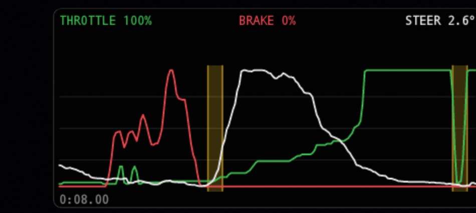 Two coasts in one eight-second window, on the exit of T12 at NCCAR with a slower car ahead. Throttle green, brake red, steering white, the MoTeC/AiM colour convention. Each yellow region has a bright line at its start and end, and it is recorded per column, so it scrolls off with the data that produced it instead of vanishing the moment the car settles. The COASTING chip under the trace is lit while the rule holds.
coasting  =  speed        > 20 mph
         AND throttle     < 90 % of learned travel
         AND brake        < 5 % of learned travel
         AND sqrt(ax² + ay²) < 0.25 g
         AND |steering|   < 30°
         AND rear slip    < 4 %
         sustained for    > 250 ms
Every term earns its place. The throttle test is a ceiling, not a floor — a partial lift held down a straight is dead time too. The g test does the real work, because a car earning its lap time is always using grip for something. The throttle ceiling covers the one case g can’t see: flat out at terminal velocity, where every g is zero and nothing is being wasted. Steering and slip cover the case where g gets it wrong — see the slide section below. And the 250 ms is so a gear shift isn’t counted as a coast.
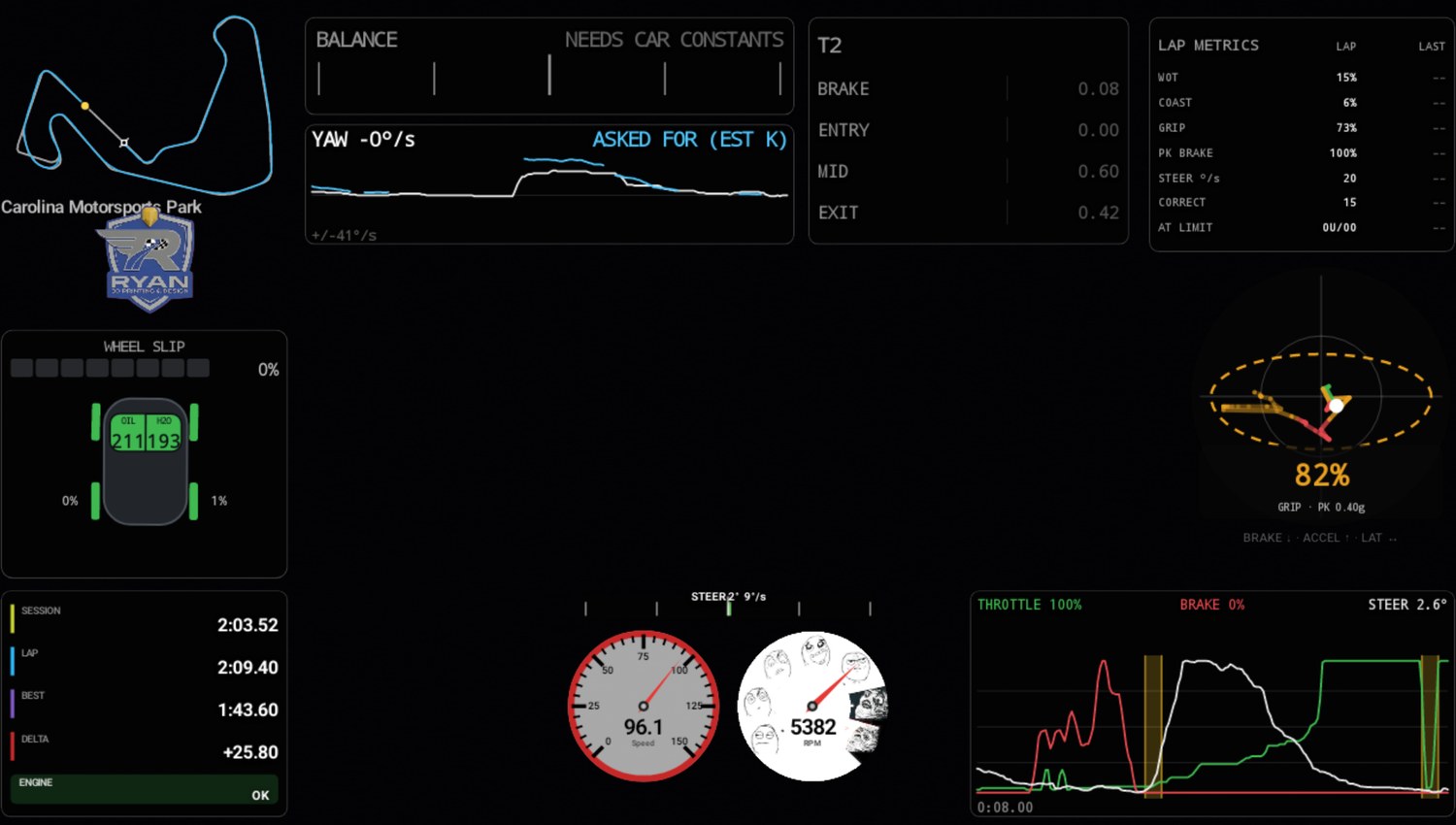 Same frame in context:
 COAST 7% in the metrics block, on the lap spent behind traffic, and the corner card pricing what it cost at T12: 14.9 mph down at the apex, 3.3 s. On the best lap of the day COAST reads 1%.
Across three real laps it reads 9.3% on the out-lap, 0.50% on my fast lap, and 0.41% on my most aggressive one.
Wheel spin versus wheel lock
A wheel turning faster than the car is spinning. A wheel turning slower is locking. Opposite problems, opposite fixes, so they’re measured separately and drawn differently.
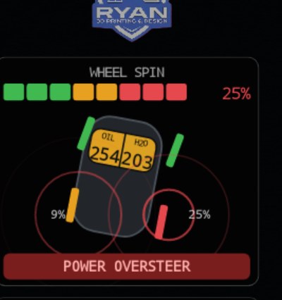 14% at the right rear and 5% at the left, on the throttle out of T7 at NCCAR. Red rings expand and fade over the tyres that broke traction, the rears colour up the green-amber-red ramp, and the chip names it: POWER OVERSTEER, because the throttle was open when the wheels let go.
Road speed without GPS
You can’t measure slip without knowing how fast the car is actually going, and GPS lags hardest under braking — exactly when a lock-up test needs it. So road speed comes from the wheels:
fastest = max(FL, FR)                       undriven, so it can only read low
roadRef = max(fastest, roadRef − 1.5 g · dt)
The rate limit is the whole trick. If both fronts lock together the estimate would collapse with them and hide the lock inside itself. Capping how fast the reference may fall at slightly more than the tyres could ever slow the car keeps it honest. This is what production ABS does with its reference velocity, for exactly the same reason.
My measured braking is p999 1.30 g across 213 minutes of logs, so 1.5 g is clear of anything real. The same figure taken from GPS speed differentiated at 40 ms claims 4.2 g, which is a good illustration of why the reference doesn’t use GPS.
The two questions
spin (rear)  = (rear − frontAvg × axleRatio) / (frontAvg × axleRatio) × 100
lock (any)   = (roadRef − wheel) / roadRef × 100
axleRatio is learned free-rolling each session — straight, off the brakes,
under 30% throttle, under 0.35 g. On my car the two axles agree to 0.32%,
which is what same-size tyres front and rear should look like, but it’s measured
rather than assumed so a tyre change or a staggered setup can’t move it
silently.
Which one it is
The rule is mine, from the driver’s seat, and it’s just torque:
Off the gas it cannot be wheelspin. Hard on the brakes it’s probably lock-up.
SPIN  if  slip > +4 %  AND throttle > 15 %
LOCK  if  lock > +8 %  AND brake    > 15 %
none  otherwise → the number prints, with no colour
That last line matters more than it looks. A reading past the threshold with both feet off is tyres and road, not something I did, and colouring it is how an instrument teaches you to ignore it.
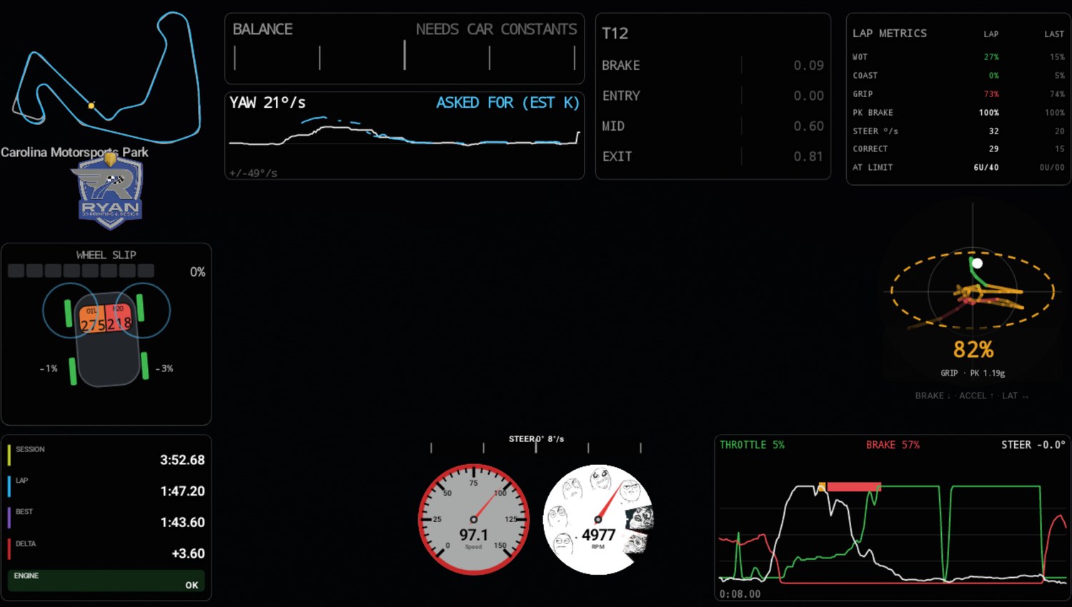 Trail-braking into T9 at NCCAR: 27% brake, 50° of lock, and the inside front has just pinged, the pale blue ring over the right front. Lock draws blue deliberately, outside the green-amber-red ramp entirely, because it is a different fault rather than a worse one. The input panel beside it is the same instant: brake still on, steering still winding in, and an amber understeer bar over the trace saying the front was already asking for more than it had.
Look at what isn’t in that frame: the tyres themselves are green. That lock lasted a couple of hundred milliseconds and was over before the screenshot landed — the ring outlives it by 620 ms, which is the entire reason it’s a ring and not just a colour change. Across 157 frames sampled over three laps I couldn’t catch a single blue-filled tyre, which is what the calibration predicts: at an 8% threshold a clean lap produces zero front-lock events. If it were easy to screenshot, the threshold would be wrong.
The radar pings
A ring flashes over whichever tyre misbehaved and fades as it expands, so you see when it happened rather than just that it’s happening.
fires when  classified event AND |slip| > 6 %  AND  260 ms since the last one
age    = (now − startMs) / 620 ms          0 → 1   ring lifetime
radius = wheelHeight × (0.5 + age × 1.9)
alpha  = (1 − age) × 220
colour = red for SPIN, blue for LOCK
A ring reads as an event. A filled dot reads as a state. The re-arm timer is why a long slide pulses instead of drawing one solid disc.
The colour ramp
One ramp, used by everything that has a colour:
t = value / limit                                   0 → 1
w = t^0.7                                           gamma weighting
w < 0.5 :  lerp(#3FB950 → #E8A020, w × 2)           green → amber
w ≥ 0.5 :  lerp(#E8A020 → #E5484D, (w−0.5) × 2)     amber → red
The ^0.7 is the important part. Linear interpolation keeps a gauge stubbornly
green until it’s nearly at the limit; gamma weighting starts the colour moving
early, so a climbing temperature is visible well before it’s a problem. Same
reason a temperature needle sweeps across its face instead of sitting pinned
until it redlines.
Used for oil and water temperature, rear slip, steering rate and grip percentage. Lock-up sits deliberately outside it, in blue.
The steering bar, coloured by how fast I turn
How far I turned is the length of the bar. How fast I turned is its colour — green smooth, red catching something.
I didn’t want to guess that scale, so I processed every log I have. The script splits each steering-rate sample by whether the rear axle was away at the time, which is exactly the question the colour needs answered:
                     p50    p95    p99   p999      n
  rear settled       5.0   75.0  152.5  312.5   307k
  rear away >5%     27.5  177.5  385.0  792.5    10k
Ordinary driving lives under about 150 °/s. Catching a slide runs 175–400. So full scale is 400 °/s, and it’s capped at 800 — one sample in the logs glitched to 1307 °/s, and an uncapped session maximum would leave every real save reading green for the rest of the day.
rate    = |Δsteer| / Δt          per sample, on the clock, smoothed 0.35
scale   = clamp(session max, 400, 800)
colour  = ramp(rate / scale)
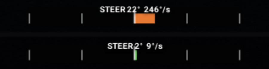 Same widget, eight minutes apart in the same session at NCCAR. 147 °/s winding on lock into T9, and 4 °/s on the straight. The rate is printed next to the angle; a colour with no number behind it is unreviewable.
AT LIMIT — asking for more than the car had
Two independent ways the car tells me I asked too much, and neither needs a measured car constant:
SAWING       3 steering reversals within 1.6 s,
             each carrying ≥ 12° of hand wheel

SATURATION   steering rose ≥ 8° across 600 ms
             while lateral g rose ≤ 0.02 g,
             held 400 ms
Saturation is understeer stated directly: more steering bought no more cornering. Sawing is me running out of ideas.
Which end let go is decided by the wheels, never the steering:
rear slip ≥ 5 % held 120 ms  AND throttle > 25 %  →  POWER OVERSTEER
rear slip ≥ 5 % held 120 ms                       →  OVERSTEER
otherwise                                         →  UNDERSTEER
The yellow and red bars along the top of the input trace
That’s where these events are drawn, and they’re the one thing on the overlay with no label next to them, so: amber is understeer, red is oversteer, and a bar spans exactly the stretch of time the car was asking for more than it had. Same colour convention as the yaw panel’s verdict.
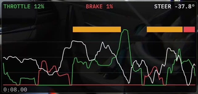 Eight seconds of input trace, throttle green, brake red, steering white, with the limit ribbon above it. Red bars are oversteer, amber are understeer, and the gaps are the car doing what it was told. This is T7 at NCCAR: two amber understeer events through the long right-hander, then a short red one the moment the throttle went down on the exit, which is the same POWER OVERSTEER the slip car flagged above.
The verdict can be upgraded mid-event, which is the interesting case. A bar shades amber while the front pushes and turns red the moment the rear lets go, so a corner that understeers into a power-on slide reads as one bar with a story rather than two separate events. It’s counted once, as the oversteer it ended as. Each bar is also backfilled to where the evidence started — a saw only qualifies on its third reversal, so without that it would mark the recovery instead of the moment that caused it.
It’s a thin ribbon rather than a full-height wash because the coasting regions are already a full-height yellow wash on that same panel, and two overlapping washes read as one confused stain.
Why slip decides when the car is working, not lateral g
This is the physics behind that third row in the sensor table, and it shapes four different widgets.
A car with the rear away isn’t generating lateral force. The accelerometer goes quiet at exactly the moment I’m working hardest. Here’s a second and a half of a real opposite-lock catch:
 t      mph  steer   latG   |g|  rearSlip%
 6.00  49.2  +46.4   0.18  0.25      5.7
 6.24  50.4  +43.8   0.17  0.24     12.3
 6.72  54.5  −10.6   0.17  0.24     16.7
 6.96  56.1  −53.4   0.17  0.24     −0.4
46 degrees of lock reversing to −53 in one second, 17% rear slip, 40% throttle —
and combined g pinned at 0.24 the whole way through. Any test written as
|latG| > threshold is blind through that, so four of them take confirmed rear
wheel slip as evidence in its own right instead:
| Gate | Would be blind at | Also accepts |
|---|---|---|
| AT LIMIT load gate | 0.55 g | confirmed rear slip |
CORRECT counter |
0.30 g | confirmed rear slip |
| Corner segmentation | 0.35 g | confirmed rear slip |
| Coasting | < 0.25 g | vetoed by steering or slip |
Slip is loudest exactly where lateral g goes quiet, which is what makes it the right corroborator rather than just another signal.
The grip circle
A dot showing what the tyres are doing now, inside a ring showing the most they have shown on this tyre and surface, kept between sessions and only ever growing. A percentile with five minutes of data behind it sets the ring, not a maximum, so one kerb strike cannot set it for the day.
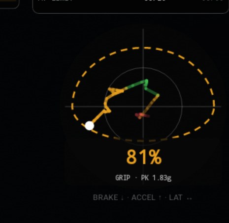 The friction circle from Milliken’s Race Car Vehicle Dynamics, at 95% of the envelope trail-braking into T9 at NCCAR, with the trail coloured by phase: brake red, lateral amber, drive green. The trail runs red down the braking axis and swings amber as the lateral builds, which is the shape trail-braking is supposed to draw. Egg-shaped on purpose: this car brakes and corners far harder than it accelerates, and a perfect circle makes every power-limited exit look like timidity.
GRIP % = current combined g / envelope radius in this direction
The envelope is banded by speed (<40, 40–70, >70 mph), because the achievable g-g set changes with speed and one session-wide envelope flatters slow corners while libelling fast ones, and the bands crossfade over ±5 mph of each edge so the ring never jumps. A band with nothing stored and under 200 live samples stands aside for the best-evidenced one rather than drawing a confident ring around twelve points.
Lap metrics
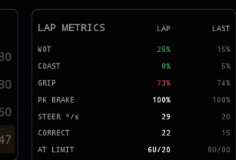 Live lap on the left, last completed on the right. Green beats the session best, red is worse.
 AT LIMIT 3US·1OS·3off counts the two at-the-limit faults separately, three understeer events and one oversteer so far this lap, because the fix is not the same for both: one is entry speed, the other is the right foot. The 3off is the subset on the wrong side of the corner, which is the line rather than the grip.
| Row | Definition | Better is |
|---|---|---|
WOT |
% of samples at ≥ 95% of learned throttle travel | higher |
COAST |
% meeting the coasting rule above | lower |
GRIP |
mean of combined g / envelope, above 0.25 g | higher |
PK BRAKE |
max brake as % of learned travel | higher |
STEER °/s |
mean |Δsteer/Δt| while more than 5° of lock is on | lower |
CORRECT |
reversals ≥ 12° and ≥ 25 °/s, while loaded or sliding | lower |
AT LIMIT |
understeer / oversteer events, as nU/nO |
lower |
STEER °/s and CORRECT are review statistics, not live scolds — a correction
that catches a slide is not a fault. They’re reported, never flashed.
Everything accumulates against the device’s own clock rather than per frame — the GL loop runs at display refresh and would triple-count every one of these.
And it accumulates against the measured telemetry rate, not the configured
one. The channels are set up for 25 Hz; what actually arrives is nearer 15,
and at times 10. So every duration on this panel comes off a clock, never off
a count of samples. A sample count that gets read as a duration is the single
most common way a metric like COAST ends up quietly reporting a percentage
of the wrong thing.
The yaw panel, and how K got measured
The balance reading compares how fast the car is rotating against how fast the steering asked it to. The gap is understeer or oversteer.
δ      = SteerAngle / steering_ratio         road-wheel angle
r_ref  = v · δ / (L · (1 + K · v²))          the rate asked for
error  = r_ref − yaw_measured                + understeer, − oversteer
That is the bicycle model from Milliken, and it sits inside every production
stability-control system. K is the understeer gradient, and with K = 0
the model over-predicts yaw badly at speed.
For most of this project the reading was dark. It needed two things: a gyro
this car had proven, and a K that was measured rather than estimated. An
instrument that is confidently wrong is worse than one that is absent, and a
driver who catches a gauge lying once stops trusting every gauge next to it.
Both landed on 12 September at NCCAR, and the verdict now prints on the yaw
panel’s footer (card 4) under the two lines it summarises. The balance bar’s
old slot went to the VS BEST ribbon, because “am I ahead” is the question
every other card serves.
The first estimate, and why it was wrong for this car
Regressing steering against lateral g directly does not work, because a slow hairpin and a fast sweeper at the same g need completely different lock: the corner radius contaminates the slope. The FSAE skidpad removes that by holding radius constant. Radius is recoverable arithmetically, so every corner in every log can contribute:
R      = v² / (a_y · g)
δ_ack  = L / R                    the angle the geometry alone needs
δ_meas − δ_ack = K_us · a_y
Over 28,736 steady-state CMP samples that gave 1.56 °/g. It was honest about being an estimate, and it turned out to be the wrong number for this car: those samples live in the low-g linear range, and this car does not corner there.
The measurement: three sweepers as a skidpad
NCCAR has three long, steady corners: T7, a 227° right at about 310 ft radius; T13, a 195° left at about 155 ft; and T6, a 169° left at about 230 ft. A car settled in the middle of each is doing what a skidpad asks for, so the nine clean laps from the two sessions were run through the same regression, with the radius taken from the gyro rather than the map:
steady   = |a_y| > 0.3 g, |r| > 0.15 rad/s, |dr/dt| < 15 °/s², steer, yaw and a_y agreeing in sign
δ_road   = SteerAngle × steering_sign / 12.5
δ_ack    = L · r / v
K_us     = slope of (δ_road − δ_ack) against a_y, on the gyro's handedness
| Corner | Direction | Samples | K_us |
|---|---|---|---|
| T7 | right | 6,051 | 4.02 °/g |
| T13 | left | 4,419 | 4.06 °/g |
| T6 | left | 4,333 | 3.97 °/g |
A right and two lefts within 0.1 °/g of each other. That is the uniform-grip assumption confirmed rather than made, and it is the number in the car file:
K = 4.0 °/g × π/180 ÷ (9.81 × 2.66 m) = 0.00268 s²/m² measured: true
Two caveats are written into the file next to it. It is the loaded-range K,
0.6 to 1.1 g. Below 0.6 g the slope is near zero and it builds toward the
limit (T7 by band: 0.1, 3.9, 5.3 °/g), which is the tyre going nonlinear, so
the reference is calibrated for where the car actually lives on a lap and
will over-predict yaw on a gentle corner. And there is aero. NCCAR is flat,
the car carries a splitter, and a two-parameter fit over 14,373 loaded
samples gives K = 5.39 − 1.54e-3 · v² °/g with v in m/s: 4.9 °/g at
40 mph falling to 4.0 at 67, which is the direction front downforce pushes.
Speed is confounded with radius across only three corners, so that is
recorded as a trend and the model keeps a single K until a fourth sweeper
at a different speed says otherwise.
The gyro proving itself
The same session settled the other half. The yaw gyro against the kinematic
yaw rate a_y·g/v over 38,086 samples above 30 mph on the clean laps:
correlation −0.988, slope −0.96. The gyro is real, and it reads the opposite
way round to the lateral accelerometer on this car, the same mounting fact
already known about the longitudinal axis. So the car file records the IMU’s
handedness as lateral_sign, and the one place the two are subtracted (the
slip-angle integrator) applies it. With that in, the slip angle peaks at
6.8° on a clean lap and never runs past the 14° sanity gate.
Run it from the paddock
The phone lives in the glovebox and I never open it. A recorder bolted somewhere you can’t reach needs to be operable from somewhere you can, and there are three ways in — none of them need the phone in your hand.
Telegram is the one I actually use. One card in the chat, rewritten in place rather than repeated, with the state written into the buttons — so the answer is visible without pressing anything:
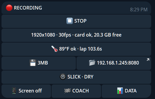 The card mid-session: recording at 1080p30, card space, phone temperature,
last lap, and the file browser’s address as a tappable link. The tyre row
shows the conditions bucket the coaching is comparing against — press it to
cycle tyre and surface without opening the glovebox — and COACH is the
button that sends the session’s numbers to the language model.
The card mid-session: recording at 1080p30, card space, phone temperature,
last lap, and the file browser’s address as a tappable link. The tyre row
shows the conditions bucket the coaching is comparing against — press it to
cycle tyre and surface without opening the glovebox — and COACH is the
button that sends the session’s numbers to the language model.
- start / stop
- camera and frame rate
- storage, and how much has been written this session
- phone temperature and whether Android has started throttling
- last lap
- the phone’s address, as a button that opens the file browser
It works from anywhere with signal, because the phone dials out rather than waiting to be reached. No port forwarding, no VPN, no knowing what address the car’s hotspot handed out this morning.
A web page on port 8080 does the same, plus the files. Any browser on the same network — a hotspot from either end is enough, and neither needs the internet. Buttons are sized for a gloved thumb, and it’s plain links rather than JavaScript, so it can’t get stuck in a state its own script invented.
The notification shade, for when the phone is already in your hand.
Pull the session onto the laptop over wifi
The card is a microSD in the phone’s SIM tray — deliberate, more on why below — and nobody wants to pull a SIM tray in a paddock. So the video comes off over the network. The web page lists everything with sizes and dates; tick what you want and it hands back a command to paste:
curl.exe -C - -o "2026-08-22_1532_CMP_000.mp4" "http://192.168.1.245:8080/dl/2026-08-22_1532_CMP_000.mp4"
Every download resumes. The server answers 206 Partial Content, so a
transfer that dies at 80% picks up where it stopped, and re-running the whole
block skips whatever already finished. That matters when the files are
gigabytes, the link is paddock wifi, and the session can’t be recorded a
second time. A zip would be one click — and one dropped connection would cost
the entire download, which is the wrong trade for footage you can’t recreate.
Clearing the card is on the same page, behind a confirmation, and only ever touches files this app wrote.
It handles the grid queue by itself
The supply to the phone is switched, and cutting it in the grid queue is an ordinary pause rather than the end of the session. Power goes, the phone — alive on its own battery — closes the file properly and tells Telegram it did. Power comes back and it starts recording again on its own, retrying while the powered hub re-enumerates the camera. Measured on the bench, cut-to-recording-again was about 16 seconds, most of which was me.
This is also why the card sits in the phone’s SIM tray rather than in a reader on the hub. The hub’s supply is the one being switched, and everything downstream of it goes away for a few seconds when that happens. The camera can afford that — it comes back. Storage can’t, because the file being written is the session. In the SIM tray it’s on the phone’s own power rail, where nothing the hub does can reach it.
It won’t record something worthless
Two things have to be true before it will start, checked wherever you start it
from: there has to be power (the supply is switched; a session that starts
on battery was never meant to be running), and the camera has to be
delivering frames — not “is a camera plugged in”, but has it produced a
picture within the last two seconds. A status line saying 1920x1080, 30 fps
is reporting the last thing the camera announced, which stays true long
after it stops sending anything. A FORCE button overrides both, off at every
launch and deliberately not remembered — an override that survives between
sessions is off on the morning you needed it.
Keeping it cool in a glovebox
The screen is the thing that makes heat in a phone nobody is looking at. The moment a recording is confirmed running, the app blanks the panel and the phone drops to a genuine sleep, holding nothing but the CPU wake lock that keeps the encoder fed. The battery holds at 80% rather than sitting full and hot all day, with the charger carrying the load. Temperature goes to Telegram — a note when it gets warm, a louder one if it gets genuinely hot, and an all-clear when it comes back down.
“Turn eight, brake at 475”
The recorder has a voice — brake calls into my helmet over Bluetooth.
I brake against the marker boards — the 300 / 200 / 100 boards the track paints before its big braking zones. So the voice doesn’t say brake now, which would make Bluetooth latency part of my braking zone. It says a number, well in advance — about seven seconds before the braking zone at whatever speed I’m carrying — and I execute it against the boards with my own eyes. Nothing about the call is timing-critical, which is what makes a $150 Android phone able to do the Catalyst’s headline trick.
The number is my own best lap’s brake point for that corner, measured back from turn-in and rounded to the 25 ft a board lets you place. That makes it a ratchet: brake later than the call, and the best updates, so next lap the call moves deeper. Compressing a braking zone stops being something I reconstruct from data on Monday and becomes something the car asks me to do, corner by corner, while I’m there.
And turn eight is really turn eight
A number burned into video that disagrees with the number on the circuit’s own map is worse than no number at all. You cannot use it to talk to an instructor, and every stored best behind it is filed under the wrong corner.
So the turn numbers are not derived from the road. They come from the circuit’s published survey, and the geometry only decides where each one begins and ends.
That split is forced by the tarmac. Turn numbering is not recoverable from the shape of the road. Measured at CMP, fourteen published turns show at most twelve curvature peaks at any threshold — some official turns are gentle enough that the road barely marks them, and consecutive turns the same way merge into one bend. VIR has sub-lettered turns, 5a and 5b, that no geometry can invent. And the circuit’s own map labels a T18 at VIR that nobody counts, because it is on the front straight — the sort of thing no data source records and only a driver knows.
What pins the numbers down is corner angle. Angle is a property of the road, so it survives whatever line is driven; radius does not, because a racing line straightens a corner out — CMP’s T1 is surveyed at 80 ft radius and drives at 50 m. Matching the sequence of surveyed angles fixes each official number to a place. CMP’s survey totals 1026° against the 1062° our map measures, a 3.5% agreement, and where several official turns share one bend they split in proportion to their surveyed angles. Checked against straights that took no part in the placement: front straight 504 m surveyed against 535 m measured, back straight 400 against 480.
On the car that reads as T1 through T14 at CMP, fifty-seven corner events, none out of sequence. VIR is deliberately still on geometry numbering until its angle table exists — the twenty-three curvature candidates matching its twenty-three labels is a coincidence, one of them a 1352 m radius that is actually the back straight. Guessing there would put wrong numbers on video, so it does not guess.
NCCAR got its numbers the same way this month, from the circuit’s new layout map: fourteen turns, T1 the hairpin through T14 onto the straight, with the new chicane as T8, T9 and T10. They are a turn list in the track file with the survey they came from, and every card, call and coaching line above uses them.
The corner identity underneath is permanent and append-only, separate from the displayed number. A corner discovered later can change what it is called without changing which stored best belongs to it — otherwise a turn quietly inherits another turn’s brake point, and the coaching starts comparing the hairpin against the sweeper.
And the numbers are honest to the paint, not to the map. The distance a board counts to sits as much as 250 ft away from where the track map says the corner geometrically begins — so every call datum is measured by reading the actual boards off my own footage, frame by frame against the GPS log, and a corner only gets a call at all if its boards have been measured. Corners with no boards stay silent, and so do corners where my best trail-brakes past turn-in — “brake at zero” isn’t a thing you can do with a board, and the system would rather say nothing than something unusable.
Coaching that knows what a corner costs
Every coaching line the overlay writes ends with measured time:
T7: braked 42 ft earlier than your best [0.4 s]
T2: 4.1 mph less at the apex than your best [0.2 s]
That [0.4 s] is not an estimate. The delta grid keeps a millisecond clock in
every metre of the lap for both the current lap and the reference, so the time
lost through a corner is the subtraction of four numbers. Findings are ranked
by those measured seconds — three things that would cut the most lap time
means top three by time, not by how often a flag happened to trip.
It can also call turn-in — early or late, in feet, from where lateral load actually rises rather than where the map thinks the corner starts — and track-out, which only speaks on circuits where the GPS is honest enough to support it, and stays silent everywhere else rather than coaching noise.
Every threshold that fires a line carries a measured flag, and a line whose
threshold is still a desk number ends in ?. As of this weekend three of the
four are measured against the corner-by-corner record (apex speed 3.0 mph,
exit speed 5.0 mph, turn-in 50 ft), each set so it fires on roughly one
corner in five. Brake-early still carries the mark.
This is what the ranking looked like after nine clean laps at NCCAR on 12 September, measured seconds per lap against my best pass through each corner: T1, the hairpin, 0.95 s; T13, the long left, 0.58 s; T14, the last corner onto the straight, 0.56 s; then T4, T8 and T7 at about a quarter of a second each. Four seconds in total, and a stitched lap of 97.16 s against a best of 100.13 s. Three corners, two seconds. That is the list the overlay exists to write.
The voice can speak this advice too, compressed to something that survives being heard at 100 mph: “brake later into turn seven.” One phrase every six seconds at most, and a brake call interrupts advice mid-sentence, because the corner that’s arriving outranks the one that’s gone. No model runs in the car — the voice is a deterministic rule reading numbers the overlay already computed, which means it works with the radio off, the cloud unreachable, and the phone in a glovebox at 140°F.
The session knows its own shape
The coaching summary opens with a pace trend — lap time fitted across the
session’s real laps: IMPROVING, STABLE, or DEGRADING, with a predicted
next lap. The moment a session turns DEGRADING, the phone sends a Telegram
message to my pocket — because when the pace falls off half a second a lap,
the answer is tyres, driver, or heat, and I’d like to be asking that question
in the paddock rather than discovering it on Monday.
Out-laps and cool-down laps are fenced statistically — a lap far slower than the session’s own spread is recorded but never coached from — so “4 mph slower at every apex” on a cool-down lap doesn’t bury the three findings that matter.
And TrackEncoder carries a kerb map — built offline from my Catalyst’s own logged laps, marking the stretches of each circuit where running wide genuinely changes the ride, tagged with the turn and the side of the road. Because the map knows where kerbs aren’t, it will never invent kerb advice at a track that has none.
The handoff: one button, three findings
What the car can’t do is notice that five findings are one habit. “T7 apex speed”, “T9 apex speed” and “T12 apex speed” are three lines in a list; “you turn in early on every long-radius right, and it’s worth eight tenths” is a level of reasoning above what a threshold can reach.
So there’s a COACH button on the Telegram card. Press it and the phone builds a plain-text summary and sends it to a language model, which reads the whole session at once and answers with a ranked three — straight back into the same chat, next to the temperature warnings.
What goes out is deliberately narrow — no video, no GPS trace, no raw telemetry. It’s the analysis the app already wrote, a few tens of kilobytes of derived numbers:
- lap times, the optimal-splice lap, and per-sector consistency
- the session’s pace trend (improving / stable / degrading, seconds per lap)
- every corner’s findings aggregated with counts, worst cases, and measured seconds lost — for today and for every session on record at that track
- which tyre-and-surface bucket the numbers came from, so the model can’t compare a wet lap to a dry one
- the circuit’s kerb map, so “use more kerb at T6” is only ever said where a kerb exists
The provider is one text file on the card — key, URL, model. The request speaks the standard OpenAI-compatible chat format, so OpenRouter, Nous, Together, a local llama.cpp on the bench, or Anthropic’s API (its shape is auto-detected from the URL) all work by editing one line. Mine currently points at DeepSeek. The model is capped at a few hundred tokens of reply: three findings and their evidence, not an essay.
Street mode
Everything above is an engineering screen for a circuit. On the road it is absurd — and worse, actively wrong: a lap timer and a corner-by-corner scoreboard on a public road are scoring me against a track I am not on, which is not a thing I want burned into video or in my eyeline.
So one empty file on the card, config/street.txt, puts the lap-shaped half
away: the ghost car, the timing stack, the consistency figures, the track
position bar, the lap metrics, and the whole coaching chain including the
brake calls in my helmet. What stays is everything that is about the car
rather than the lap — wheel slip and the radar pings, the grip circle, the
yaw panel, the steering rate, the dials, the input traces. Those mean
exactly as much on a back road as they do at CMP.
Delete the file and the next launch is a track day again.
Conditions, and why the coaching never mixes them
One more thing that sits underneath all the coaching: every corner best is filed against the tyre and surface that set it. A dry slick lap is not a target to chase in the rain, and chasing it is worse than having no target — the driver either dismisses the overlay or trusts it and crashes.
So there is a conditions field, cycling 200TW · DRY → SLICK · DRY → STREET ·
DRY, the same three wet, and then STREET MODE before it wraps. STREET is
the street-compound drift rubber I run at some NCCAR and CMP events, which is
a different grip world again. STREET MODE is the road-driving switch from the
section above, riding the same control because it answers the same question —
what am I doing today — which means street mode is one button press from
the Telegram card too, right when the car is being driven home. Changing any
of it re-points the history at a different file rather than mixing buckets,
and takes about two seconds when it starts raining at lunchtime and I am
nowhere near the car.
Where the ideas came from
- Paradigm Shift Racing, Racing Line Fundamentals — the whole basis of the green ideal-apex marker. #1, The Acceleration Point for why the acceleration point sits at the apex regardless of what follows; #2, The Ideal Apex for the acceleration-versus-cornering ratio governing apex placement, and for the 90° entry limit I borrowed as the span of the mapping. The Rules Of Racing Line Optimization and the Racing Line Infographic + Apex Troubleshooter are the quick reference for the apex spectrum the marker is trying to place a car on. The linear mapping across that span is my own, and the source is explicit that these principles are not meant for precisely calculating a line — see the honesty note in the apex section.
- Ross Bentley, Speed Secrets — coasting as the primary time-loser; brake/throttle/steering traces as the first thing to read in any log.
- Milliken & Milliken, Race Car Vehicle Dynamics — the friction circle, the bicycle model, the understeer gradient and the reference-yaw-rate relation.
- The FSAE skidpad procedure — the standard way to measure an understeer gradient. I did it arithmetically instead of physically.
- MoTeC i2 and AiM RaceStudio conventions — throttle green, brake red, short trace windows so one corner fills the panel, steering smoothness as a primary channel.
- Production ABS reference velocity — the fastest-wheel road-speed estimate with a bounded deceleration.
- Racing games — the painted driving line coloured by pedal phase, and the ghost car as the natural display for “ahead or behind”.
Source is at github.com/MrBlahhhh/TrackEncoder
— docs/metrics-explained.md has the same content as a reference, and
tools/calibrate.py regenerates the numbers from a log directory.